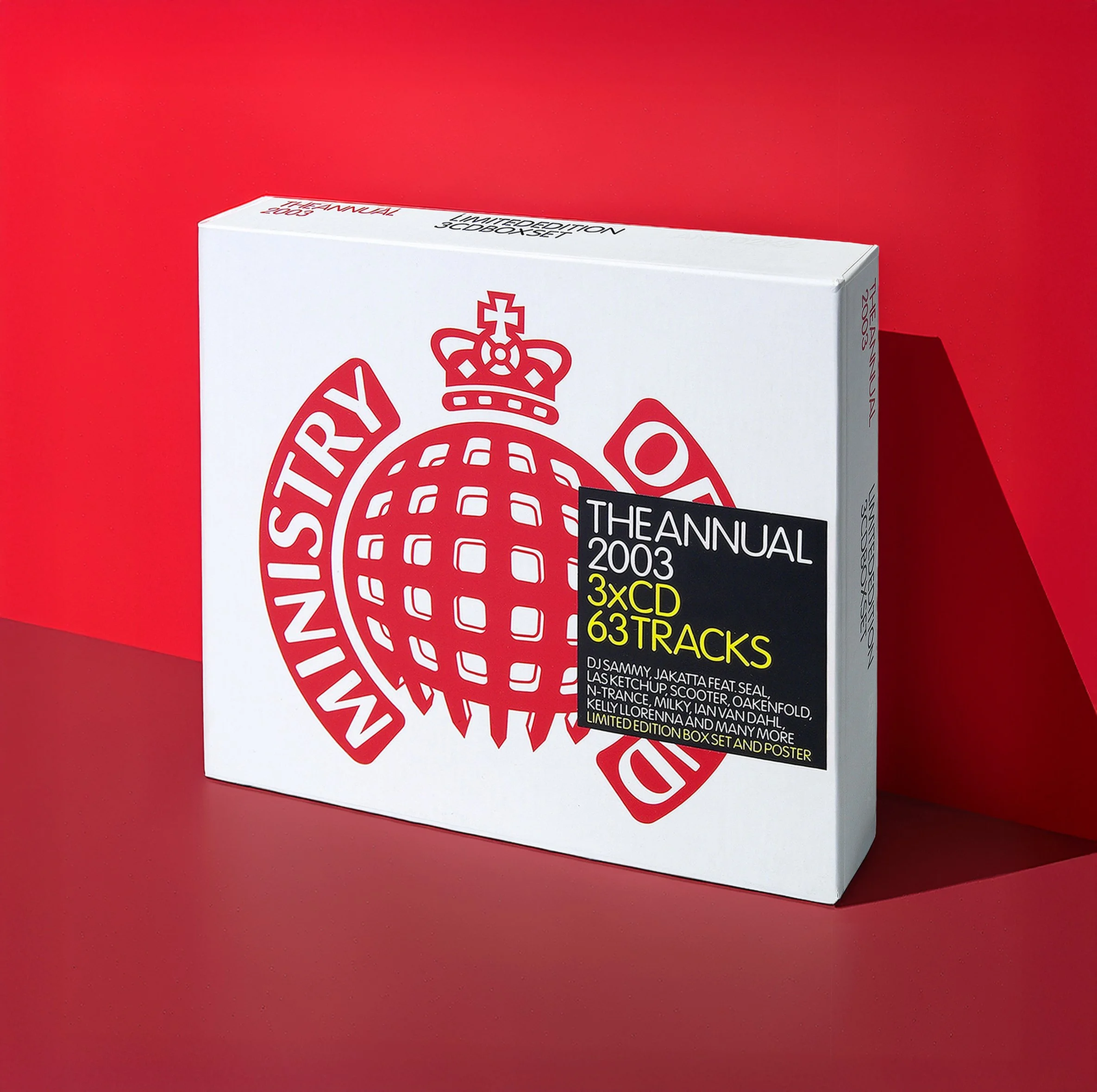
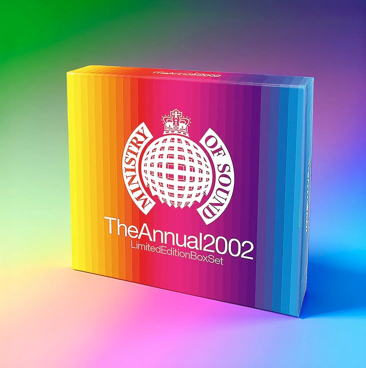
Designers spend many years obsessing over things such as ‘negative space’, ‘grids’ and ‘kerning’. These theories and practices have been developed over decades of trial and error by some of the greatest creative thinkers. One of the most common client request is to ‘make the logo bigger’.
The Annual series was becoming increasingly commercial in it’s musical direction and that same request kept coming my way. For the 2003 release (and the launch of the updated logo design) I made the logo so big the title had to go on a sticker over the top.
More like this:
Ministry of Sound - Logo
Ministry of Sound - The Annual (Part One)