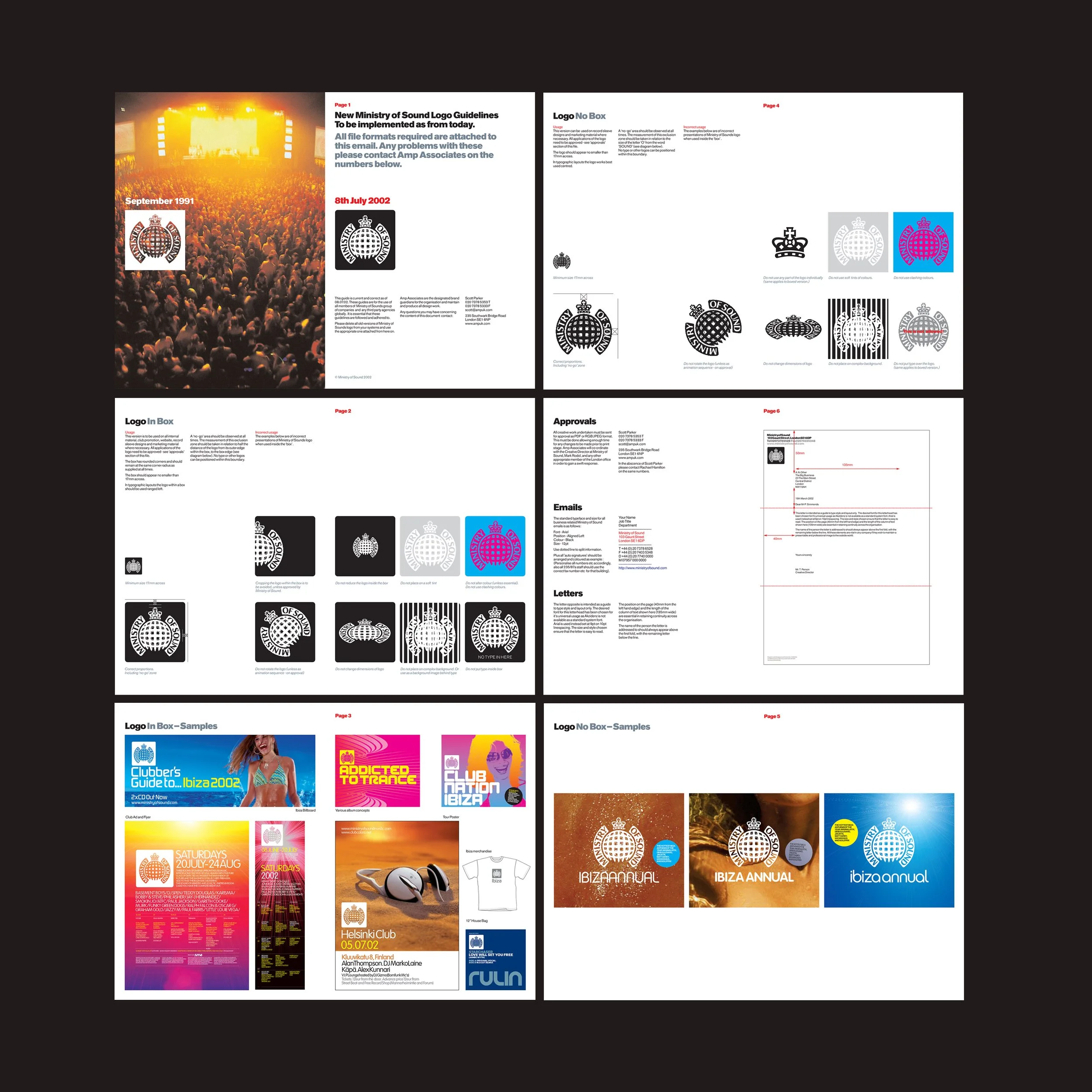
The Ministry of Sound logo is a totem to clubbing and one of the most well known music logos in the world. It signifies authority and authenticity, it’s iconic and ironic, it embodies a punk rock attitude that underpins the brand. Mobile phones were becoming more powerful by the week, online music and retail was taking over and the logo looked increasingly complex in these environments.
There was an opportunity to start again and design a new logo, but it just didn’t feel like the right thing to do. Without the portcullis and the establishment style of the logo the name doesn’t make sense, plus by now it was firmly secured into the fabric of youth culture. It would seriously upset some people if we ditched it all together.
We produced hundreds of variations of each component. Different crowns, portcullises and typefaces. I enlisted the help of Dalton Maag, a renowned font creation studio, to work on a bespoke typeface.
More like this: